Elevate Your App’s Aesthetics: Crafting a Vibrant and Tasteful Color Scheme with Material Theme
Material 3 is Google’s latest design system that brings a refreshed look and feel to Android applications. One of its key components is theming, which includes defining a cohesive color scheme for your app. This guide will focus on using Material 3 for theming, with a particular emphasis on colors, composition, and light and dark themes, with practical implementation steps.

Color Hierarchy in Material 3 Theming:
Material 3 defines a color hierarchy consisting of several key color categories:
- Primary: The primary color is the main color that defines your brand identity and is used for visually prominent elements. It is like the star player on your team.
- Secondary: The secondary key color complements the primary color and plays a supportive role. It is like the wingman, providing harmony and balance to the design.
- Tertiary: The tertiary key color is like the wildcard, providing contrasting accents and provoking interest. The tertiary color is typically a color that is created by mixing a primary color with a secondary color. It makes visual elements ‘pop’!
- Background: Neutral colors are used for background and surfaces in the app. They create a clean and unobtrusive backdrop for content, ensuring readability and visual balance.
- On-Color: This category includes color variations that ensure text and icons remain visible and legible when placed on top of the primary, secondary, tertiary, or background colors.
By using these colors effectively, you can create a well-balanced and visually engaging design that captures the user’s attention, communicates your brand identity, and ensures a pleasant user experience.
Color Selection and Usage:

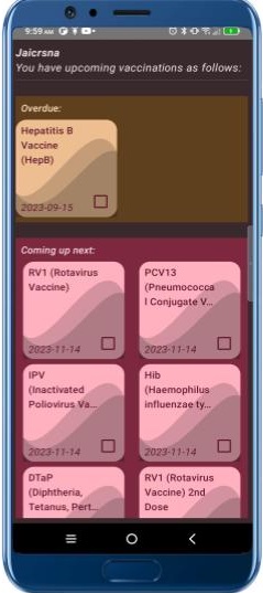
The theme includes specific color variations like “Primary Container” and “On Primary Container” in the Material 3 theming system. These variations are part of Material 3’s extended color system and are used for fine-tuning the appearance of different UI elements within your app. Let’s explore these variations:
- PrimaryContainer (
MaterialTheme.colorScheme.primaryContainer): In Jetpack Compose, we use containers for laying out visual elements. This color is typically used for the container of a primary element. It harmonizes with the coloration of primary elements in the foreground, such as buttons, cards, etc. - onPrimaryContainer (
MaterialTheme.colorScheme.onPrimaryContainer): This color is designed to ensure text and icons remain readable and accessible when placed on top of the primary container. It provides sufficient contrast to maintain good visibility. You can use it for text and icons within primary containers to ensure readability.
The theme extends to container variations for primary, secondary and tertiary elements. Every container has the on-container color variants for legibility of text and icons.
To summarize, the primary color comes in four flavors as follows: primary, on primary, primary container, on primary container. Likewise, secondary and tertiary.

Light and Dark Themes:
Material 3 supports both light and dark themes to enhance user experience and cater to user preferences. When designing your app, consider the following:
- Light Theme: Typically uses a light background with dark text and components. It provides a clean and inviting appearance suitable for most scenarios.
- Dark Theme: Inverts the color scheme, featuring dark backgrounds with light text and components. It is easier on the eyes in low-light conditions and can offer a unique visual aesthetic.
Implementation Checklist:
- Create Theme with Theme Builder:
- Visit the Material 3 Theme Builder website.
- Provide the primary color in hex code and the builder will generate the scheme, including primary, secondary, tertiary, and background colors.
- Export the generated
Color.ktandTheme.ktfiles for Jetpack Compose.
2. Integration into Your Project:
- Cut and paste the contents of each file into the eponymous file in the
utilpackage of your project. Be sure to include the dark and light colors.
3. Apply Colors to UI Elements:
- In
MainActivity, the root composable must be wrapped in the app theme for theming to work. The app theme is declared inTheme.ktnear the end. Optionally, further wrap the root composable in aSurfacewith tonal elevation to apply background theme color to every screen. - Apply the primary colors to the main elements in each screen, specifying the theme color like so:
MaterialTheme.colorScheme.primary. UtilizeonPrimary,primaryContainerandonPrimaryContaineras needed. - Likewise, apply secondary, and where needed, tertiary colors to style UI components. Fine-tune the aesthetics using the variants included with the theme, experimenting to get the desired effect.
By following these steps and leveraging Material 3 theming principles, you can create visually appealing and user-friendly Android apps that align with the latest design trends and provide a consistent and engaging user experience.
